


he Joy of Reporting in Tigersheet- An Interactive Video Guide to Keep Your Work Sorted!
Visualization and Reporting are one of the most vital motivation users want to go through all this trouble building an application and pour all their data into it. You can have numbers for each day and each month, and still, with all this detail, you can’t see the forest for the trees.
You might have a faint idea as to what product sells well and what does not, or which ad campaign seems to work better but it’s always until you have a chart produced, or a ranking report generated, that you get the clear idea of what’s going on for your business.
Creating reports from data stored is generally a tedious and labor-intensive job. The good news is that with Tigersheet in place, you don’t have to worry about this!
Tigersheet offers a wide variety of powerful reporting options such as Standard Views, Charts, Pivot Tables, Kanban Boards, Grouping Items and Filtered Views. This enables you to easily analyze your data and derive great insights. The intuitive drag and drop interface further make it super easy to construct the required reports in a matter of a few minutes!
Scheduling Reports
Once created, you can automatically send reports to your colleagues, executive management and non-Tigersheet users by scheduling the desired reports daily, weekly, monthly or yearly.
Once the Report scheduler is configured, specified reports will be delivered to the recipients as an email attachment.
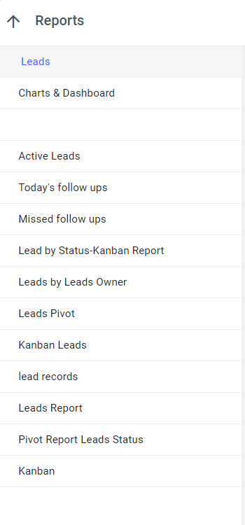
Standard Report
Users can create their own Views by Grouping, Filtering, and Hiding Columns, etc.
- To create a view, click ‘Create View’, on the left panel under the Reports option and chose the type of report/view you want to create.
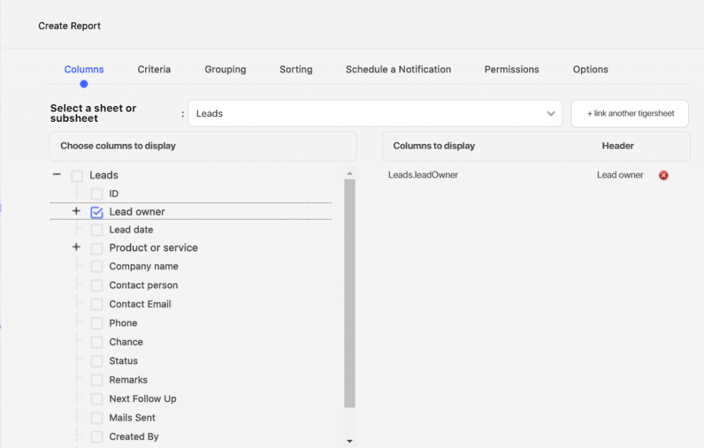
2. Under the columns section, chose the column you want to add in your view by ticking the checkbox.
e.g.: Suppose you want to create a view where you want to display all the leads based on the salesperson assigned to them. Go to the grouping section and chose Group by ‘Leads. leadOwner’.
3. The view appears on the left-hand side under the default view.
4. You can make any report/view as a default view for you by clicking on the Pin icon next to that view/report.
Watch our video that shows how to create a standard report in Tigersheet:-
Pivot Report
A pivot report is a table that is used to store the summary of a certain data set in a condensed manner.
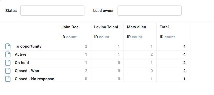
Pivot reports are useful to show counts, sums, the average for different groups. For example, Show the totals No. of opportunities at each sales stage for each salesperson, or show the count of open opportunities at each sales stage for each salesperson.
Watch our video below to see how you can create a pivot report in Tigersheet:-
Kanban Report
A Kanban board is a work and workflow visualization tool that enables you to optimize the flow of your work, limit work-in-progress, and maximize efficiency.
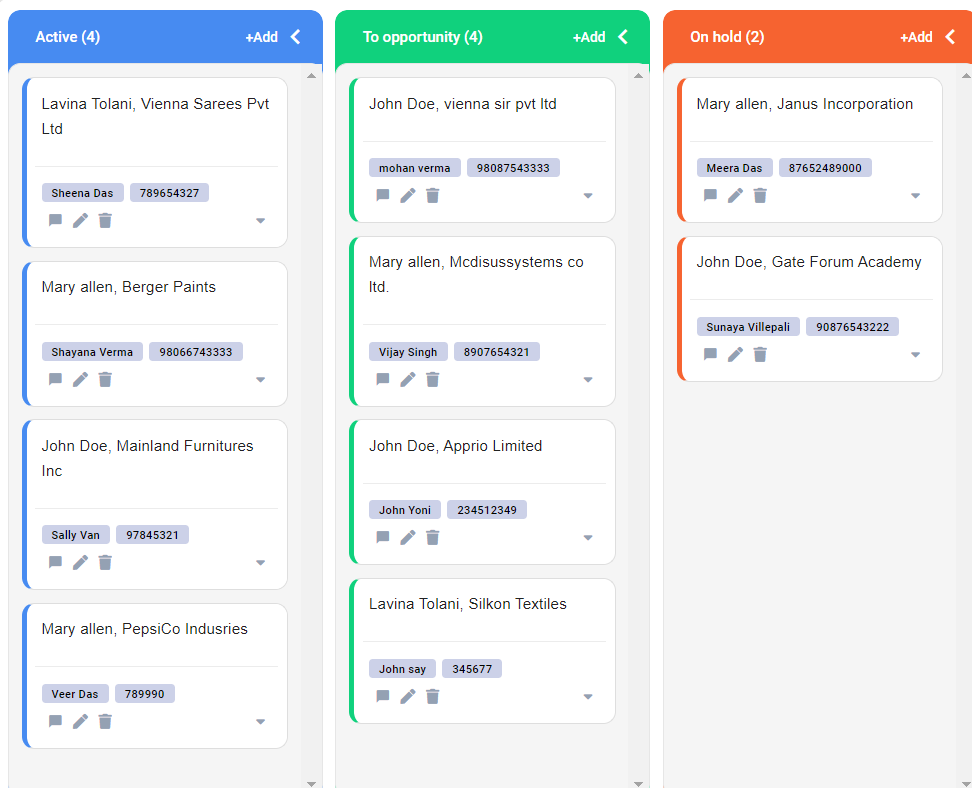
Using a Kanban board, one can view work at various stages of a process using cards to represent work items and columns to represent each stage of the process.
Here’s a step by step video to create a Kanban Report in Tigersheet:-
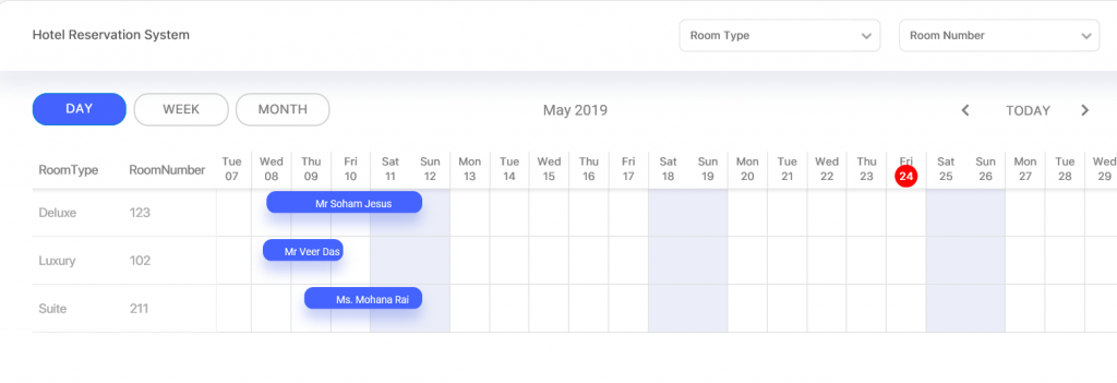
Timeline View
A timeline is a type of chart that visually shows a series of events in order over a linear timescale. The power of a timeline is that it is graphical, which makes it easy to understand critical milestones, such as the progress of a project schedule.
Let us consider an example of a hotel management system, where the hotel manager creates a timeline view of his guests’ check-in and check-outs.
- To create a timeline view, click on ‘Timeline’ under Reports.
- Configure your timeline by choosing a Start and End date.
- Select column names you want to display on the y-axis in the timeline chart.
- You can even customize the timeline view by choosing event colors and text.
- Once done, click ‘Save’.
Check out the video to understand how you can generate a timeline and manage your work in progress:
Viewing a report
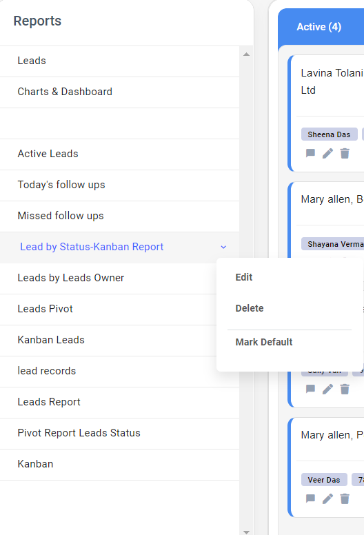
Once a report is created and saved, it will appear on the left panel.
You can mark a view/report as a default view for that sheet by clicking on the pin icon. This will be the default view for that user only.
Editing or Deleting a Report
You can rollover the mouse on the Report or View name. You will see the Edit and Delete icon appear next to the Report.
Export a Report
You can export any report in CSV and XLSX (Excel spreadsheet), and then send the export to your accountant/payroll, keep as a personal backup, or import data into a spreadsheet and analyze the results.
- Create the view/report/ sheet with the data filtered/ searched you wish to export.
- Click on the Export button
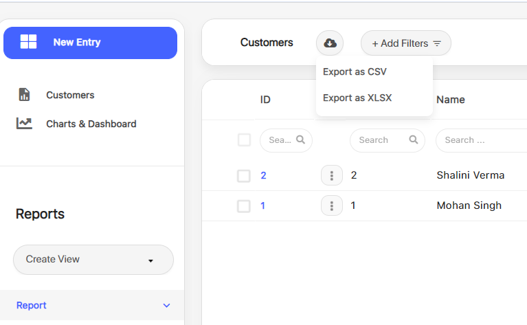
- The visible rows will be exported in an Excel / CSV file.
- If there are sub-sheets in the sheet, they will be exported in another tab with the main sheet identifier. You can click on the main sheet identifier, you check the records for that sub-sheet
Watch the video to see how you can export a report step by step:-
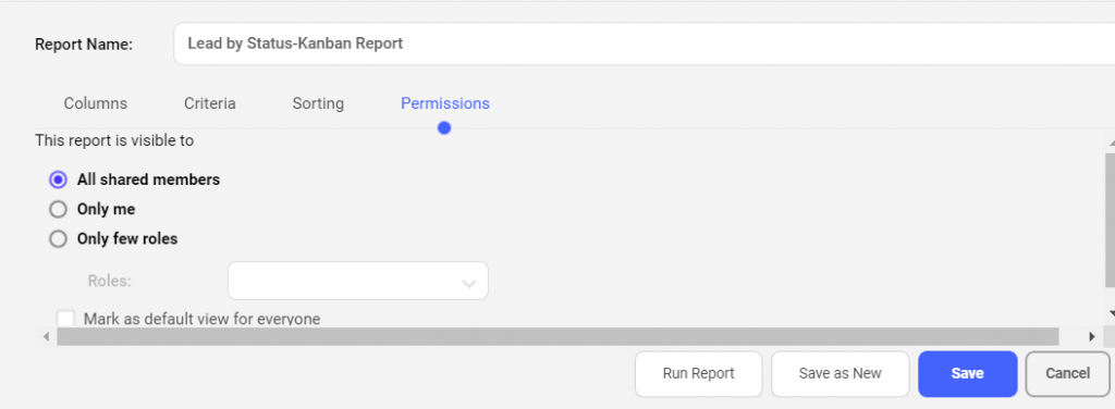
Report Permissions
By default, the report will be shared with all the users of the sheet.
You can also hide this report from other users of this sheet using the Permissions tab. You can choose which user groups should have access to this report.
Options –
- By default, each report displays 20 records.
- You can override this setting and choose to display more records per page using the ‘Options’ tab.
- You can set to show 50 / 100 / 500 / 1000 / 2000 records per page.
- You can also set how many max records should be displayed.


IT
5 Big Challenges facing CIOs and IT leaders in Pandemic 2021

LCNC
The Ultimate Guide on How to Find a Low code/No code Platform for your Business

LCNC
5 Important Metrics to Measure the ROI of Low-Code

LCNC
8 Essential Factors of Low-code/No code Software


LCNC
The Best No-code Apps for Website Development

IT
Task Management App Vs. Work Execution Platform: What Do You Need and What’s the Difference?

IT
Digital Transformation: 7 Important Questions for Your Organization

LCNC
7 Reasons Why Low code is the Ideal Solution for Business

IT
Top 10 Types of Software Every Business Needs-Infographic

General
The Best Airtable Alternatives to Look Out for in 2021 and Beyond